Optimising the End-to-End Digital Experience to Drive Engagement and Sales
(Redesign to Launch)
Project Summary
Client : Major Telecom Company
Domain : Telecom Industry
Role : Senior Technical Lead – UX Design (Responsible for Design Strategy, Leadership, Cross-Functional Alignment & Ensuring Business Value)
Users : Ecommerce Customer (who want to buy multiple related items (combos) at one go)
Tools : Figma
Primary Business Goal
Boost revenue by making combo deals clearer, more visible, and easier to use—encouraging users to choose bundles over individual items or abandoning their carts.
Problem Statement
Users found combo deals confusing and hard to trust because pricing was unclear, deals couldn’t be customised, and there was too much information to process. This made them avoid bundles, abandon purchases, and miss out on upsells, which hurt conversions and revenue.
Key Persona

User interview with Jessica
-
When you first see a combo deal banner on a site, what comes to mind?
-
How do you usually decide whether to click on a deal or ignore it?
-
On a combo deal page, what information do you expect to see immediately?
-
Is it easy or hard to understand what you’re saving with a bundle? Why?
-
When looking at the items in a bundle, how do you decide if it’s better than buying separately?
-
Would you like the option to swap or upgrade items in a bundle? How important is that to you?
-
At checkout, what reassures you that buying a bundle is the right choice?
-
Have you ever abandoned a bundle at checkout? If so, what made you stop?
-
After buying a bundle, how do you judge if it was a good deal?
-
Can you recall a time you felt disappointed or pleasantly surprised after buying a bundle? What caused that feeling?
Journey map of Jessica - Gathered insights from user interview

We used heuristic evaluation, competitor analysis, and a micro-survey to get a complete picture of the user issues.
Diagnosing Usability Issues through Heuristic evaluation
1
Ambiguous "combo" labels
Confuses users about what’s included
2
No customization for combos
Frustrates users expecting control
3
Lack of savings highlight
Missed persuasive opportunity
4
No tooltips or inline help
Cognitive overload, potential confusion
5
Visual clutter in price section
Hard to parse actual value vs. original price
6
Compare Combo Deals
Comparison view of multi combo deals
7
Estimated Delivery Timeframe
Lacks clarity on expected delivery timeframe

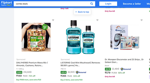
Competitior Analysis of flipkart Combo Deals
1
User Rating Visibility
User Feedback Visibility and Rating Indicators
2
Trust & Credibility Badge
Trust Signals and Platform-Endorsed Badging
3
Prominent Pricing & Discounts
Prominent Price Anchoring and Visual Contrast
4
Savings Emphasis
Discount Framing and Value Proposition Messaging
5
Visible Product Quantity Information
Information Clarity on Item Count
6
Flashing timer for quick purchase
Flashing countdown timer to create urgency for quick purchase
We added a quick, on-page survey to capture user pain points and uncover needs we might be missing. (Click Enlarge view icon to view micro survey)
Please wait Its loading.
Feedback from micro survey - Total Participants 798 users
Overall, how satisfied are you with the Combo deal?
Very Satisfied - 110 Users,
Somewhat satisfied - 210 Users,
Neither satisfied nor dissatisfied - 200 Users,
Somewhat dissatisfied - 150 Users,
Very dissatisfied - 128 Users.
Please enter your comments here
It’s hard to tell what’s actually included in the combo. - 1 User
What is the purpose of your visit?
Account Management - 165 Users,
Browse phones and plans - 175 Users,
View or pay bill - 150 Users,
Technical support - 120 Users,
Upgrade my phone - 110 Users,
Purchase an accessory - 78 Users
Synthesized all user insights, prioritized the most important findings, and removed duplicate feedback to keep the outcomes clear and actionable.

Ideation process

Design Solution
Please wait Its loading.
Results from A/B testing and analytics after the redesign
-
Conversion Rate
- 85% Increased purchasing combo deals after redesign -
Drop off Rate
- 90% decrease in drop-off during the purchase journey -
Time Completion Rate
- 80% increased understanding and purchasing the combo deal

