Enhancing Comodo Free Firewall Sales Performance
(Redesign to Launch)
Business Objective
Increase downloads, attract qualified leads, and drive paid conversions for Comodo Free Firewall with a landing page that builds trust, clearly communicates value, and makes the user experience effortless.
Problem Statement
The Comodo Free Firewall landing page failed to meet its business goals, showing low downloads, weak lead generation, and poor sales performance.
Target Users
-
Security-Aware Home User (Primary Persona)
-
Small Business Owner / IT Generalist (Secondary Persona)
Focused on the primary persona to extract deeper insights.
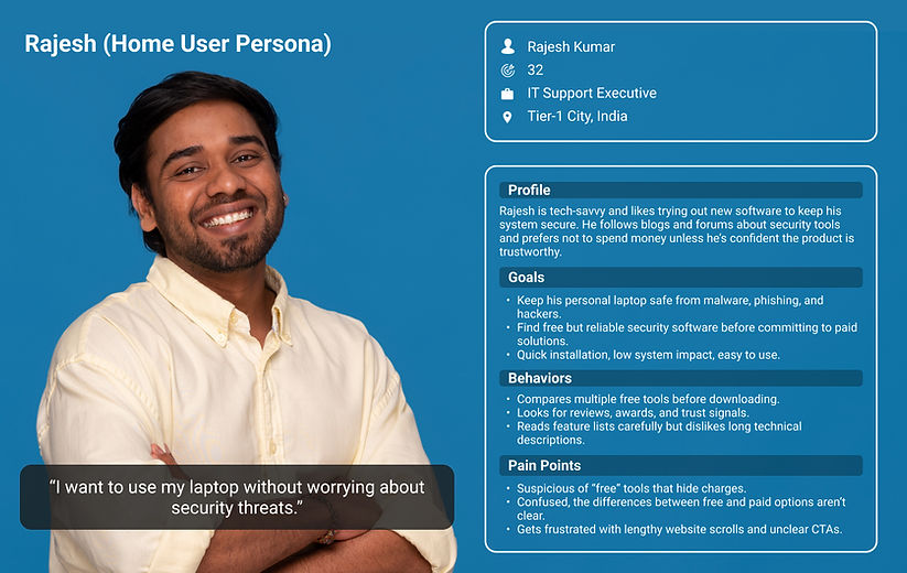
User scenario for Rajesh
Rajesh, a 32-year-old IT support executive, wants to protect his laptop for free. He finds Comodo’s website but feels overwhelmed—the page is cluttered, technical, and unclear. The “Free Download” button is hard to spot, and trust signals are buried. Frustrated and unsure about the product, he leaves without downloading anything.
Rajesh User Journey

Redesign solutions from Rajesh User Journey
-
Awards, certifications, and credibility badges are displayed upfront.
-
Side-by-side Free vs Paid comparison with clear features, pricing, and CTAs
-
Strong, dual CTAs (“Free Download” + “Get Full Protection”), system requirements listed to reduce friction.
-
First fold simplified → clear CTA, Windows version info, and product purpose explained in plain words.
-
Visual blocks → “Why Comodo Firewall is Different” + “What’s Inside” sections with concise, benefit-driven text.
-
Clean, prominent Free Download CTA supported by awards → instant trust
Design Solution
First Fold
Before Revamp

After Revamp

We made it easy for users to take action by adding a clear, prominent “Free Download” button and simple info about Windows compatibility, so there’s no guesswork. Displaying the product’s award-winning credentials upfront immediately builds trust.
At the same time, We strategically placed “Get Full Protection” button to guide users toward upgrading, turning interest into paid subscriptions. This approach educates users while boosting leads and revenue.
Second & Third Fold
Before Revamp

After Revamp

We highlight international awards upfront to build trust and show COMODO Firewall as a proven security solution. Key sections like “Why Comodo Firewall is Different” and “What’s Inside” clearly explain features, benefits, and compatibility, giving users confidence and guiding them toward both free downloads and paid upgrades.
Fourth Fold
Before Revamp

After Revamp

In the fourth fold, a side-by-side comparison of the free and paid versions lets users quickly see feature and pricing differences, making it easier to understand the value of upgrading. Clear CTAs—“Free Download” and “Get Full Protection”—guide their choice. Below that, detailed system requirements ensure compatibility, reducing friction and drop-offs.
We ran A/B testing using a control page and a variation page to see which layout helped users make decisions more easily. Below are the metrics
400% increased free download conversion
250% increased sales revenue
By clearly showing the value of the paid version and addressing doubts, the design helped users confidently try the free version and consider upgrading to premium.
Full page view of control and variation design


